a website for survivors of brain injuries providing them with free resources and research studies
Helping Brains Heal
Team Lead in UX/UI Design and Development
2024
Overview
Helping Brains Heal aims to support clinical research in acquired brain injury (ABI) rehabilitation and increase accessibility to treatments for individuals with enduring symptoms of ABI.
Results
The Helping Brains Heal website enhanced accessibility, secured grants for concussion care boxes, connected users to critical research, and drove donations, amplifying recovery support. These successes garnered media attention, landing features in multiple news outlets.
My Contributions
- Led the design of the user interface from scratch
- Led the development of the website and deployment
- Coordinated meetings with other developers and the founder

Background
My Role:
As the lead designer and developer for Helping Brains Heal (HBH), I contributed to creating an accessible digital platform that connects concussion survivors with critical resources, including donation and grant-funded care boxes, research opportunities, and community support. HBH is a nonprofit initiative dedicated to improving recovery outcomes through technology, education, and donor engagement.
What is Helping Brains Heal?
HBH is a nonprofit organization that helps people recovering from concussions by:
- Providing free care packages filled with recovery tools
- Connecting patients with medical research studies
- Raising donations to support more concussion survivors
In other words...
We’re like a helping hand for concussion recovery, giving out healing kits, matching people with doctors doing research, and collecting donations to help more brain injury patients get better.
❌ The Problem
Every year, millions suffer from concussions, but many struggle to access proper recovery resources.
Survivors often face:
- Financial barriers to care supplies
- Difficulty finding relevant research studies
- Lack of centralized, trustworthy information
- Limited public awareness about concussion aftercare
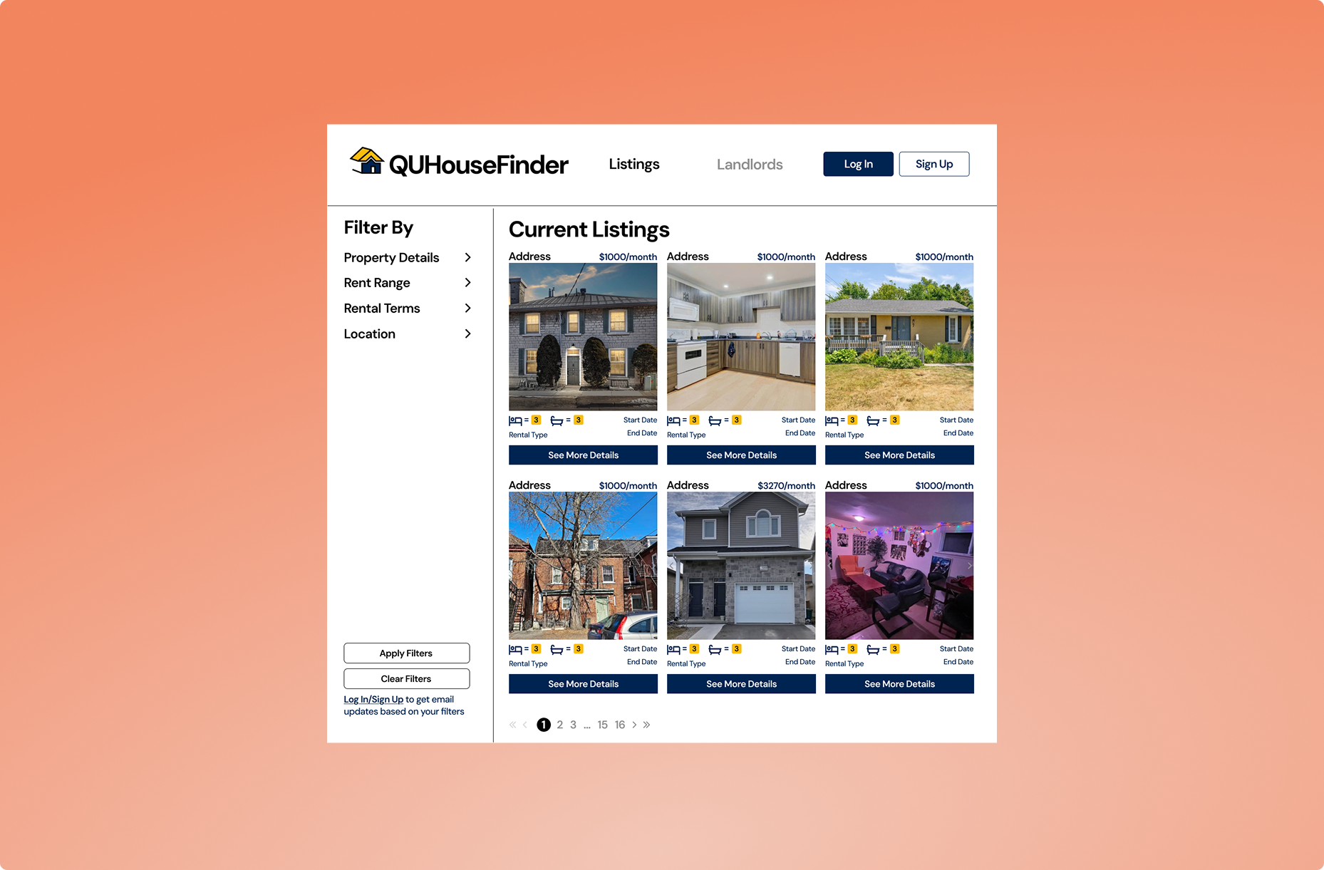
✅ The Solution
- Unified Platform: Aggregates all rental listings in one place, eliminating the need to switch between sites.
- Modern Interface: Streamlined, user-friendly design with intuitive navigation and up-to-date features.
- Integrated Messaging: Built-in chat system for direct communication between landlords and tenants.
- Landlord Reviews: A rating system to help students identify reliable landlords and avoid problematic ones.
- Smart Filtering: Customizable search options (price, location, lease type) to simplify comparisons and reduce decision fatigue.
User Research

Initial Research
To build a truly effective solution, we conducted extensive research with concussion survivors, caregivers, and medical professionals. Here’s what we learned:
- Many concussion survivors struggle to afford recovery supplies
- Patients and caregivers spend excessive time searching for reliable resources
- Most are unaware of available clinical research opportunities
- Isolation during recovery negatively impacts mental health
User Behaviours Observed
- Strong preference for mobile-friendly access to health information
- Users require multiple trust signals before engaging with services
- Complex medical language creates barriers to participation
Competitive Analysis
Part of my research included evaluating existing solutions and noting their strengths and flaws. Users consistently abandoned existing resources due to overwhelming interfaces and unclear processes, directly informing our simplified, user-centered design.

Concussion.org
- Strengths: Well designed UI, good resources, credible
- Flaws: No medical research study participation resource

Brain Injury Canada
- Strengths: Simple, minimalistic UI, very informative
- Flaws: Information overload, a lot of reading
Mockups
Designing the website
Before starting the mockups, we came up with a general branding guide, including colours, fonts and the logo.
Colour palette
For the colour palette, we stuck with black, white and different blue shades.
The blue shades ranged from a dark blue to a light blue and were used to promote a sense of professionalism and calmness.


Typography
For the typography, we used Satoshi for headlines and subtitles and Erode for body text to promote a professional, calm and friendly tone.
Logo
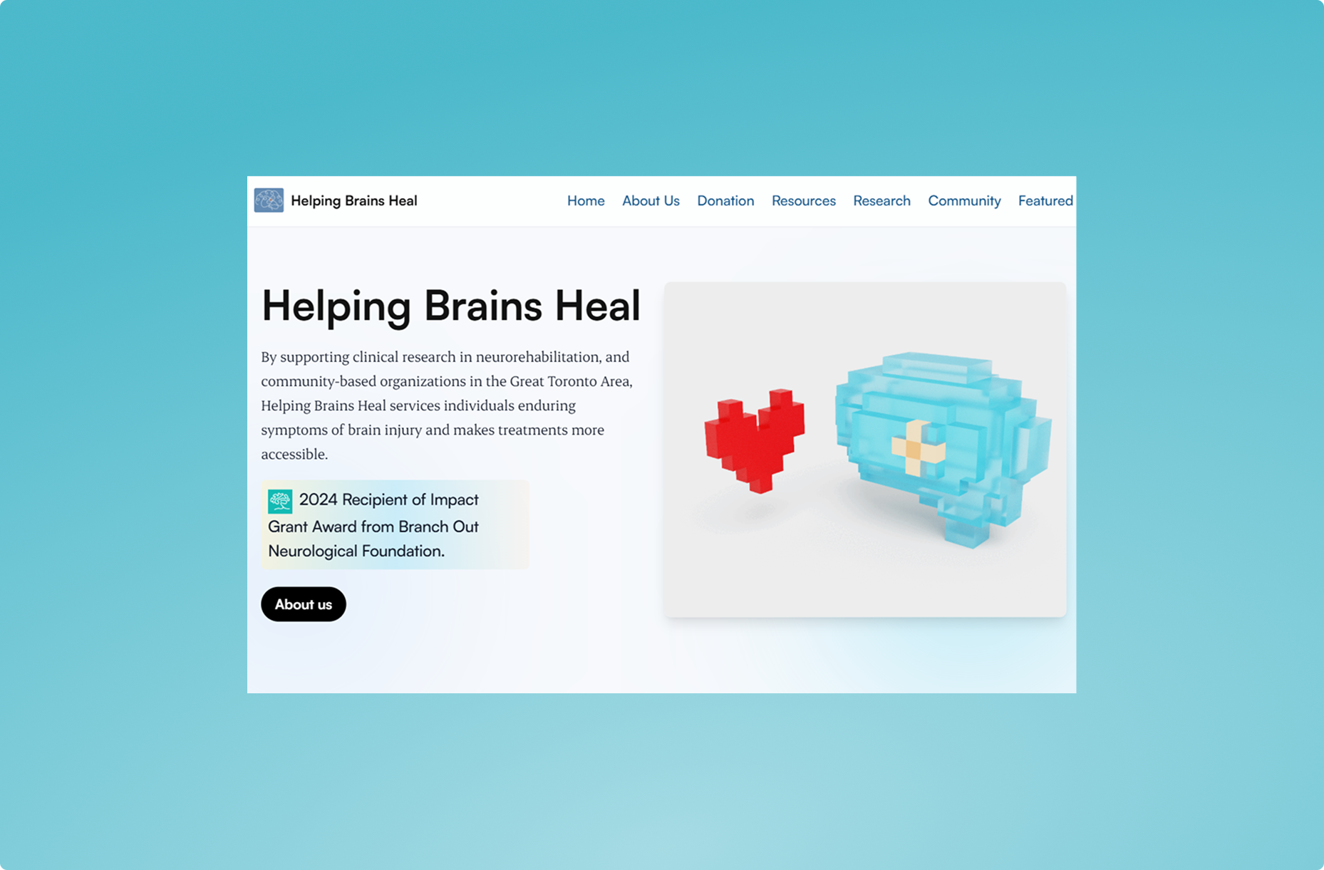
The Helping Brains Heal logo features a simple vector brain with a bandage, visually representing brain injury recovery. The clean design conveys care and professionalism while remaining instantly recognizable across all platforms.

Through weekly design reviews with my team, we designed the mockups and features to strengthen the UX.
Home
The clean home page highlights two priorities: donations and treatment resources, with minimal design for effortless navigation.


About
The clean, informative about page highlights our mission and includes a news section link to build credibility through media coverage.
Treatment opportunities
The treatment oppotunities page links to free resources and communities, and has practical checklists and FAQs for concussion/stroke recovery.


News
The news page highlights media features, showcasing Helping Brains Heal’s coverage in trusted publications and partnerships to reinforce credibility.
Donations
The donations page uses persuasive messaging and a visual progress bar (tracking donations toward the goal) to motivate contributions. A prominent “Donate Now” button drives immediate action.


Research opportunities
This section provides verified medical studies for users to join, with clear details on participation requirements and study benefits. Designed to connect patients with credible recovery research.
Development
Coding the design
The process involved coding responsive designs for desktop , tablet and mobile while incorporating animations and interactive elements using React.js and Tailwind CSS. On the backend, Strapi was set up for content management, enabling dynamic sections for clinics, community partnerships, and donation features for the founder. Comprehensive QA and testing ensured usability and functionality across devices, with ongoing adjustments based on team feedback during check-ins.
Coming at the development phase with a designers POV, it was both a challenge and a blessing to be creating designs, while also keeping expectation for development realistic. Being able to design the website and knowing all the technical aspects including margins, padding, colours and more really allowed me to have an intuitive sense of the design of the website.
Final Review
Final thoughts
This project taught me how to design with empathy and precision, transforming complex medical challenges into intuitive solutions. Through user research, I discovered how simplicity builds trust (like streamlined applications for concussion care boxes) and how visual cues (progress bars, clear CTAs) drive action. Most importantly, I saw firsthand how thoughtful design can turn isolation into connection, whether through research matching or community support. A powerful lesson in creating impact through user-centered decisions.
Future Enhancements
Even after finalizing the website, we identified valuable additions for future iterations:
- Broaden access with multilingual/telehealth options
- Add personalized recovery tracking
- Expand local resource networks
- Innovate donor engagement strategies
These features would further increase the number of people we can help.