a housing platform for all Queen’s University students that makes house searching less stressful
QU House Finder
Team Lead in UX Research and Design
2025
Overview
QU House Finder was designed to simplify the stressful process of finding off-campus housing for Queen’s University students. Recognizing the frustrations of navigating disconnected platforms, outdated listings, and unreliable landlord communication, our team created a centralized solution that brings clarity and efficiency to the rental search.
Results
The platform tackled three major pain points: scattered listings, lack of landlord transparency, and inefficient communication. By integrating intuitive filters, verified reviews, and direct messaging, we streamlined the experience, helping students compare options faster, avoid problematic rentals, and connect with landlords seamlessly.
My Contributions
- Led the user research process to enhance usability
- Led the design of the user interface from scratch
- Created report entailing findings of user research

Background
My Role:
I was part of the QU House Finder team, working alongside Minh Huy Truong and Nicholas Li to address the challenges students face when searching for off-campus housing near Queen’s University. My contributions included conducting user research, designing low to high-fidelity prototypes, applying UX principles to create an intuitive interface, and creating a detailed report describing changes that occurred during iterative prototyping. I focused on streamlining the search process, improving communication between tenants and landlords, and ensuring transparency in rental listings.
What is QU House Finder?
QU House Finder is a centralized online platform designed to simplify the rental search process for Queen’s University students. It aggregates property listings, provides advanced filtering options, and integrates tools for direct communication with landlords, along with a review system to evaluate reliability.
In other words...
QU House Finder helps students find off-campus housing without the hassle of juggling multiple websites or dealing with poor communication. Think of it as a one-stop shop for rental listings, landlord reviews, and seamless messaging, all tailored to student needs.
Before Qu House Finder...

❌ Before Qu House Finder students dealt with...
- Fragmented Listings: Rental properties are scattered across multiple websites forcing users to juggle tabs and repeat searches.
- Outdated Tools: Existing platforms are slow, clunky, and lack modern features.
- Poor Communication: Landlords and tenants rely on inefficient methods leading to delays and confusion.
- Lack of Transparency: No system for landlord reviews, leaving renters vulnerable to bad leases or scams.
- Overwhelming Choices: Users struggle to compare properties due to inconsistent filters and disorganized data.
✅ With Qu House Finder students have...
- Unified Platform: Aggregates all rental listings in one place, eliminating the need to switch between sites.
- Modern Interface: Streamlined, user-friendly design with intuitive navigation and up-to-date features.
- Integrated Messaging: Built-in chat system for direct communication between landlords and tenants.
- Landlord Reviews: A rating system to help students identify reliable landlords and avoid problematic ones.
- Smart Filtering: Customizable search options (price, location, lease type) to simplify comparisons and reduce decision fatigue.
User Research


Initial Research
We conducted initial research to understand the challenges students face when searching for off-campus housing near Queen’s University and compiled it into a 2 page report.
The findings highlighted several key customer problems:
- Fragmented Listings: Students struggle to find housing because rental postings are scattered across multiple outdated platforms (e.g., Queen’s Off-Campus Housing, Facebook Marketplace, property management sites), each with poor navigation and inconsistent information.
- Poor Communication: Landlords often rely on inefficient communication methods like email, leading to delays and confusion. Students also lack transparency about landlord reputations.
- Information Overload: Comparing properties is tedious, as users must juggle multiple tabs, manually adjust search filters, and decipher inaccurate listings.
- Lack of Guidance: First-time renters, including international and graduate students, are unaware of tenant rights or how to identify illegal lease clauses, leading to rushed decisions.

Competitive Analysis
Part of my research included evaluating existing solutions and noting their strengths and flaws. Some potential solutions we identified included:
- Aggregating listings into one interface with unified search filters (price, location, lease type) to reduce tab-switching and cognitive load.
- Integrating in-app messaging to replace email/Facebook, with tracking for tours and interviews.
- Introducing a review system to highlight reliable landlords and flag problematic ones.
- Providing clear, accessible information on tenant rights and lease best practices.

Queen’s Off-Campus Housing
- Strengths: Official university-affiliated platform.
- Flaws: Outdated UI, slow performance, limited to email communication, and lacks modern features like filters or reviews.

Property Management Sites (e.g., Axon, Limestone)
- Strengths: Professional listings with structured data.
- Flaws: Limited to their own inventories, forcing users to visit multiple sites.

Facebook Marketplace/Groups
- Strengths: High adoption among students and landlords.
- Flaws: No standardized listings, spam risks, and no tools for comparisons or landlord verification.

Reddit/Discussion Forums
- Strengths: Crowdsourced advice on landlords and neighborhoods.
- Flaws: Unorganized, time-consuming to navigate, and lacks real-time updates.
Wireframes
Thoughts to low fidelity wireframes
I sketched the main pages of website layout using a paper prototype and planned what elements would live based on user feedback and intuitive design ideas.
Home Page

Individual Listing Page

Landlord Profile Page

Based on user feedback, we refined the mid-fidelity wireframes to improve usability. The navigation was enhanced with an navigation bar, while search filters were streamlined and grouped to reduce clutter. We also reorganized the structure of the individual listing page for a more intuitive user experience.
Home Page

Individual Listing Page

Landlord Profile Page

We also designed other sections including a log in overlay, a sign up overlay, and a dedicated message hub.
Sign Up Overlay

Log In Overlay

Message Hub

Mockups
Mid fidelity to high fidelity
I sketched the main pages of website layout using a paper prototype and planned what elements would live based on user feedback and intuitive design ideas.
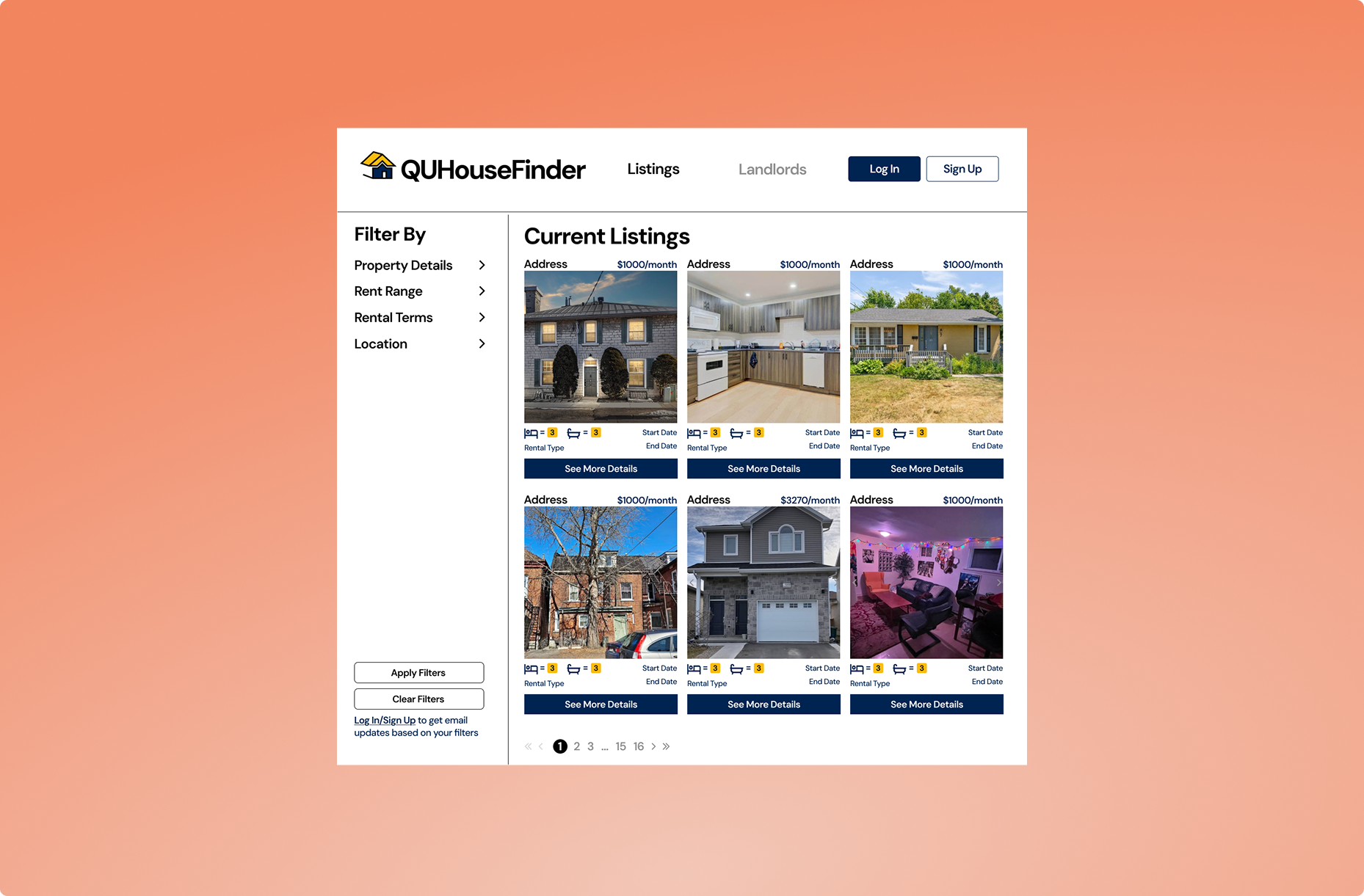
Home
The home page serves as the entry point for users, featuring a scrollable list of rental listings with relevant text paired alongside property photos. A collapsible filter bar provides customizable search options while maintaining a clean interface.


Individual listing
The individual listing page showcases the rental’s photos and key details, including a snapshot of the landlord’s rating for quick reference.
Log in/Sign up
The login and signup overlays enable account creation and authentication, granting full access to platform features. Strategic placement of access prompts throughout the site encourages user registration.


Landlord Profile
The landlord profile page showcases verified reviews from tenants who have rented or communicated with the landlord, prominently featuring an average rating summary at the top for immediate visibility.
Landlord directory
This comprehensive directory allows users to easily browse all landlords on the platform, featuring search functionality, filters (independent landlords vs. property management companies), and sorting options by rating or name. Each entry provides quick access to verified reviews and landlord profiles, enabling renters to research reputations and submit feedback—streamlining the process of finding trustworthy housing options.


Message hub
The messaging hub displays users’ conversation history with landlords, enabling seamless follow-ups, while integrated links to landlord profiles allow for quick review submission after interactions, streamlining both communication and feedback processes.
Final Review
Final thoughts
Through this project, I developed hands-on expertise in Figma prototyping, user research methodologies, and practical application of HCI principles to solve real-world problems. As team lead, I successfully coordinated our 3-member team, delegating tasks effectively while guiding the project from ideation to high-fidelity prototypes. This experience significantly strengthened both my technical design skills and collaborative leadership abilities.
Future Enhancements
Even after finalizing our core designs, we identified valuable additions for future iterations:
- A Terms & Conditions hub highlighting common lease violations to educate renters
- Listings integration on landlord profiles to view active properties
- A dedicated landlord UI for property management and tenant communication
These features remain in our pipeline to further improve transparency and usability.